DOX Centre for Contemporary Art is not like many other museums. Located in the charming neighbourhood of Prague-Holesovice and housed in a redesigned former factory, it is definitely the place to go for design lovers. The entrance price is 180 CZK (25 euros) and allows you to access the exhibition area, the cafe, the bookstore, and the design shop.
Even though probably his most catchy characteristic is the Gulliver Airship, a zeppelin that lays on its roof (and that is used as a venue for concerts and other events), what really got my attention was its corporate identity.
The logo was created by the graphic designer Aleš Najbrt and the graphic concept was created by KesselsKramer agency. Their visuals are based on only two colours: red and white. Their logo uses basic shapes: a square, a circle, and a cross.

These shapes can be seen over and over again in flyers, postcards, and signs. You would say that this is not out of the ordinary, and it isn’t. But what makes DOX special is the use of the sense of humour, with a tiny bit of irony, in their materials. Let’s see some examples.
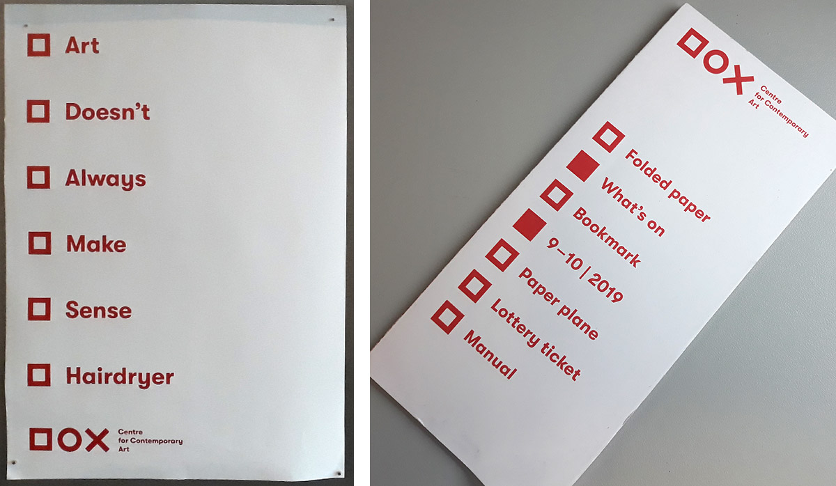
Here you can see a poster and a flyer that look like a checklist. In the case of the poster, the last option gives sense to the other options. In the case of the program, the marked items tell you which information you will find inside.

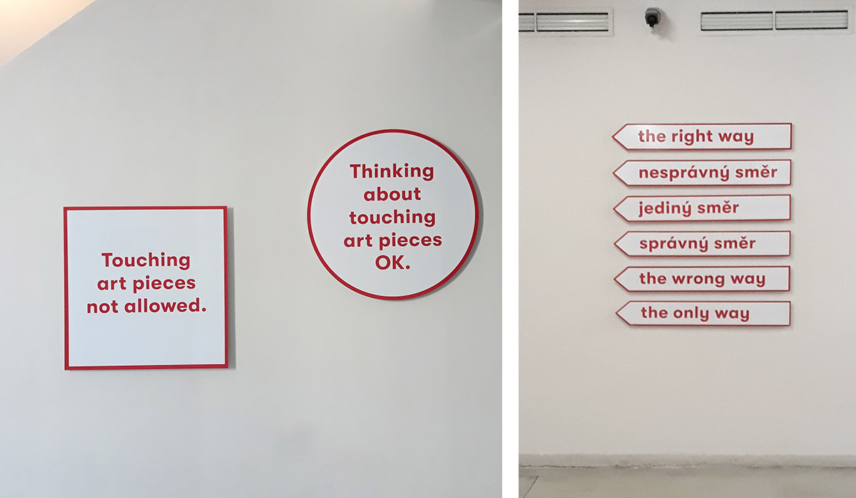
Sings are necessary for all museums. They indicate the way you should follow, or let you know what you can or cannot do (like touching or taking photos). Here you can see how they transformed something that usually is boring into something worth photographing.

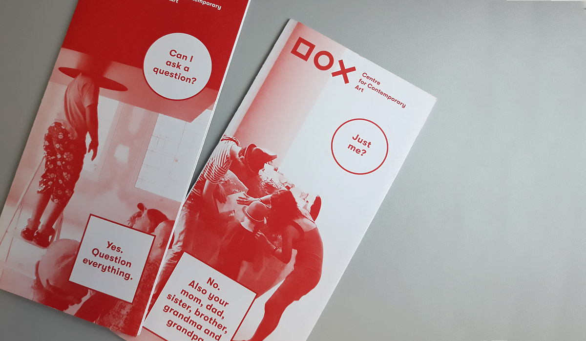
I also love how they use many times the trick of questions and answers instead of titles or plain instructions.

As you can see in the pictures, their font, Helvetica, sans serif and bold, is easy to read and works perfectly in red with white background and inverted. This is maybe the most conservative decision of their identity.
You can also appreciate that they do not use any other colour than red, not even for the images. This was true for all the materials. I could not find a single black letter anywhere. Considering that red is usually assigned to danger, I find this decision very brave.
To sum up, DOX makes a strong statement with its corporate identity, and most importantly, it reflects not only aesthetics but also its personality.
